Product roundup: UX and security improvements

Team Dandi – Jan 24th, 2024
We're always working to make Dandi even better for HR & DEI teams. Here's a quick recap of the latest improvements.
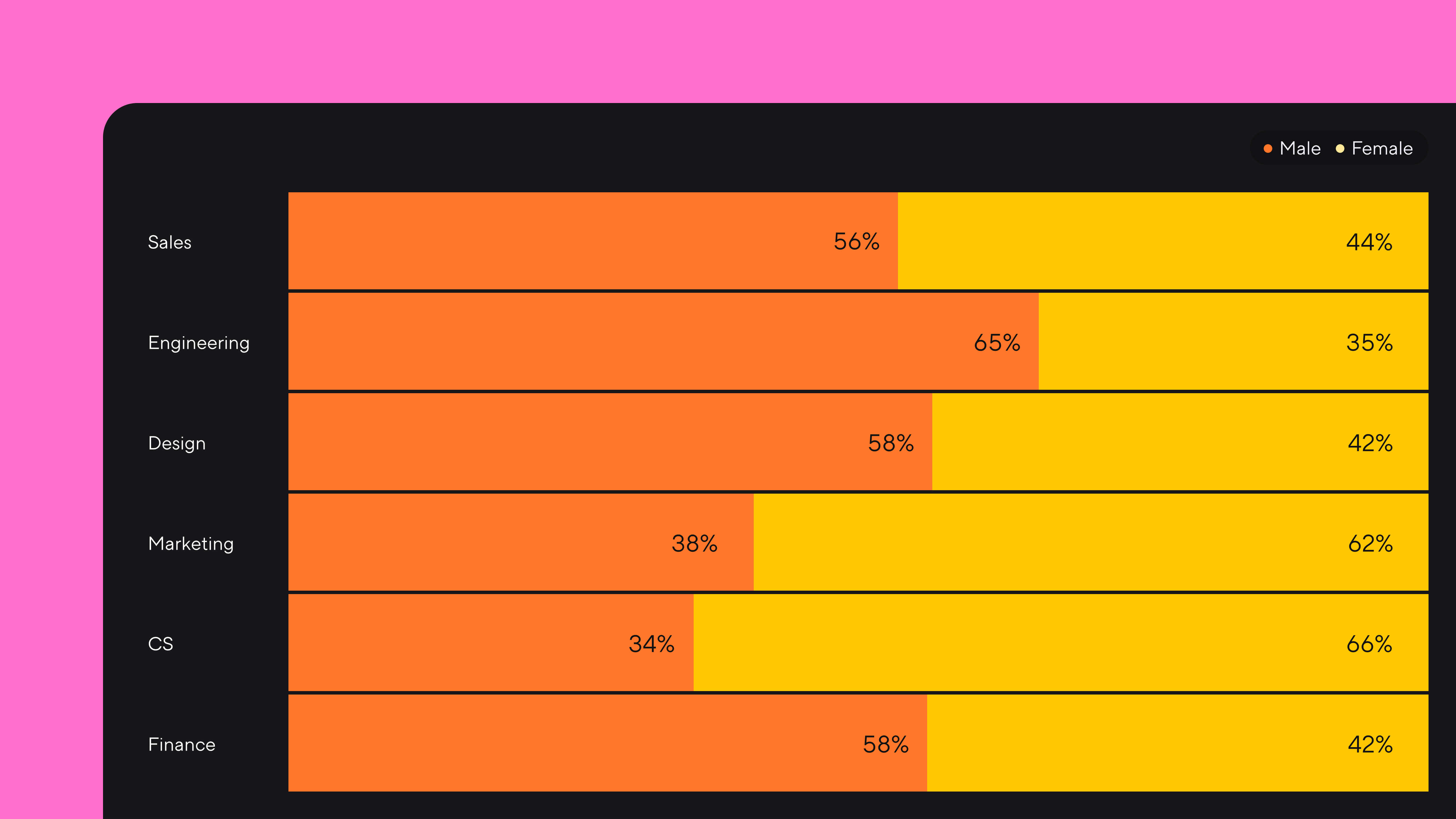
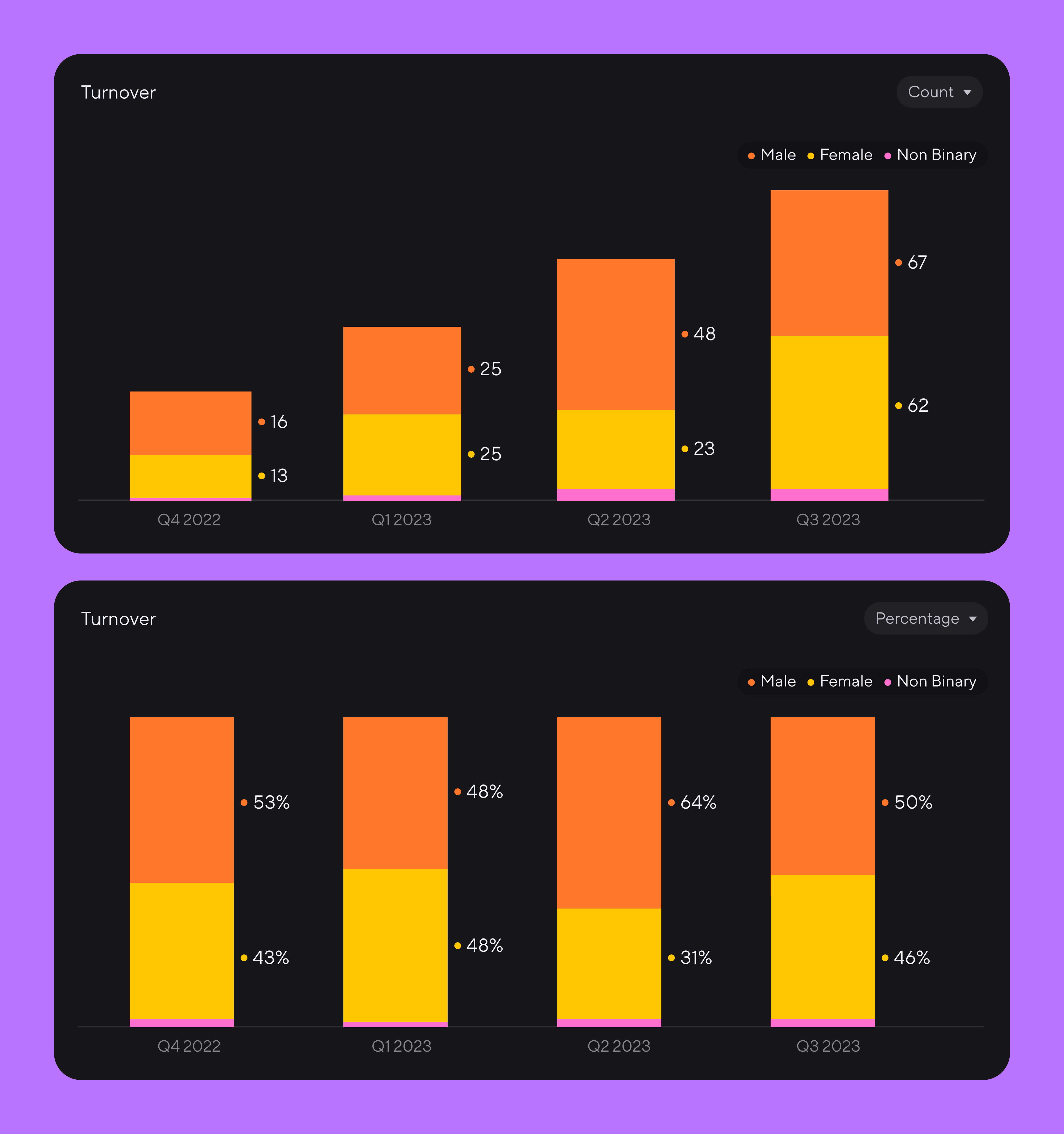
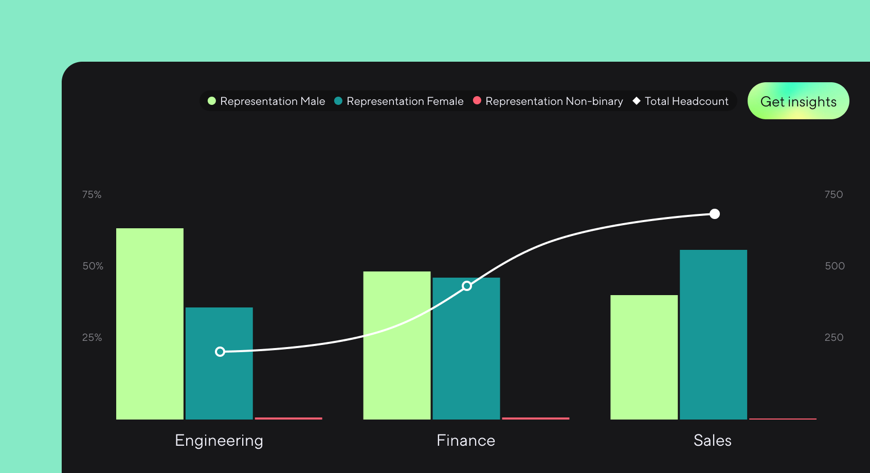
New horizontal bar charts—one of several recent improvements to Dandi's visualizations.
We introduced tons of new features in 2023: tracking for recruiting bias, goal tracking, SOC 2 Type 1 monitoring, enterprise-grade roles and permissions controls, and Dandi Self-ID.
To close out the year, we focused on UX and security updates across every part of the platform. Here’s a roundup of the biggest improvements:
Visualizations
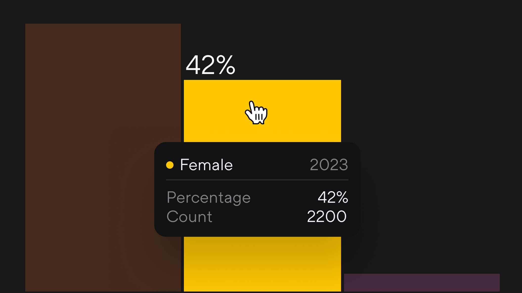
Hover state
Users can now hover over visualizations to reveal metadata.
This was a top feature request from customers. A hover state adds depth and flexibility without cluttering visualizations, making them more powerful tools for data-driven decision-making.
Horizontal bar charts
We introduced horizontal bar charts as the newest pre-built visualization in Dandi.
Horizontal bar charts are excellent for comparing different groups or categories. This could mean comparing departments, teams, or demographic groups on metrics like employee satisfaction or turnover rates.
They also naturally lend themselves to ranking items like skills gaps, training needs, or employee engagement scores by department. They visually communicate priorities or areas of concern.
Toggle y-axis
Another frequent request from customers, users can now toggle between percentage and count on the y-axis of graphs.
Toggling adds a useful layer of context when viewing data in Dandi. Depending on the analysis, either counts or percentages may be more relevant. For instance, when looking at employee turnover, absolute numbers (count) give a sense of scale, while percentages can be more useful for comparing across departments of different sizes.
Metrics and reporting
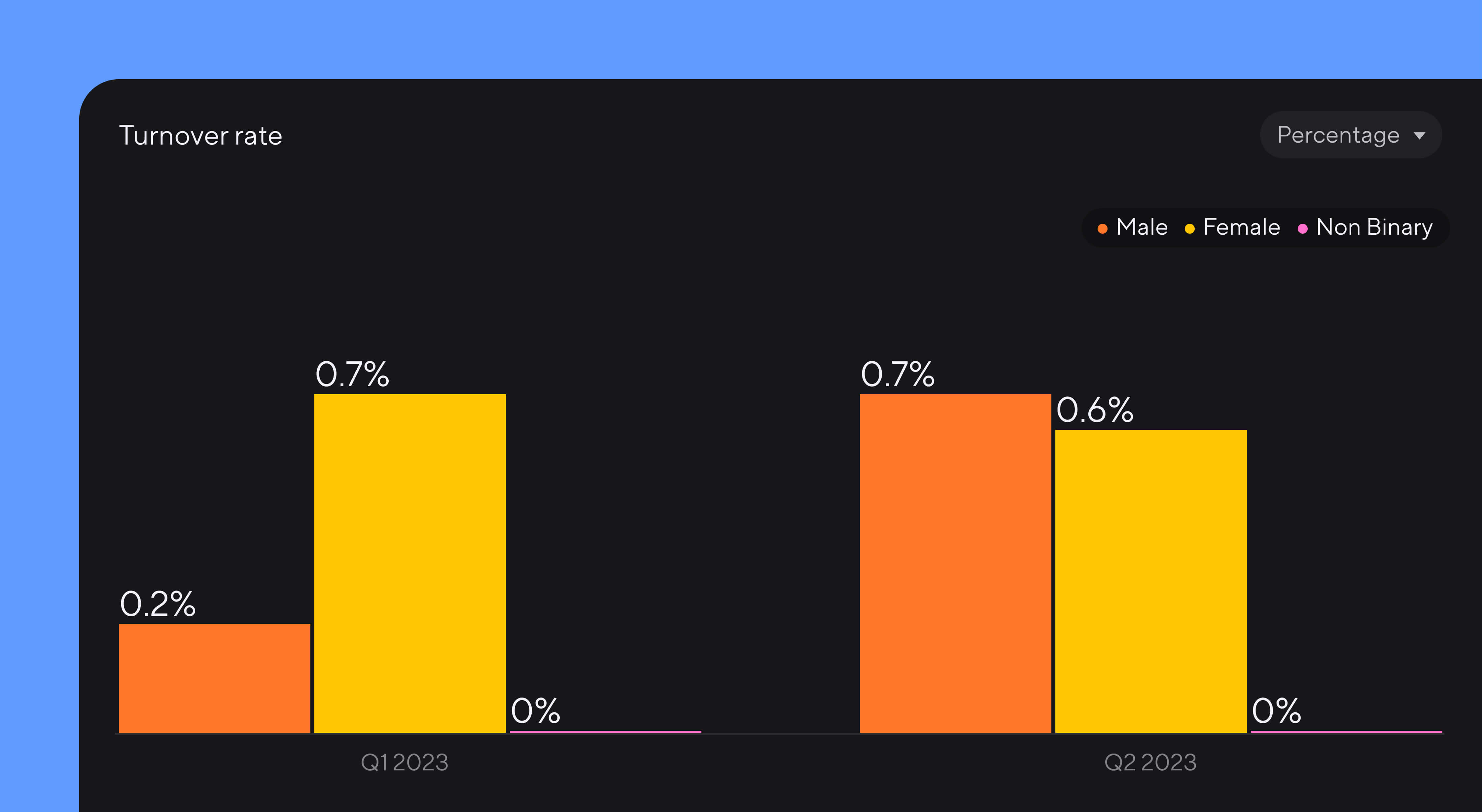
Turnover rate (non-indexed)
Turnover rate can now be represented in Dandi without an indexed calculation.
Presenting the turnover rate in its basic form (like a simple percentage or raw number) makes the data straightforward and easy to understand for all stakeholders, regardless of their analytical background. This can be especially important in communications with non-technical audiences.
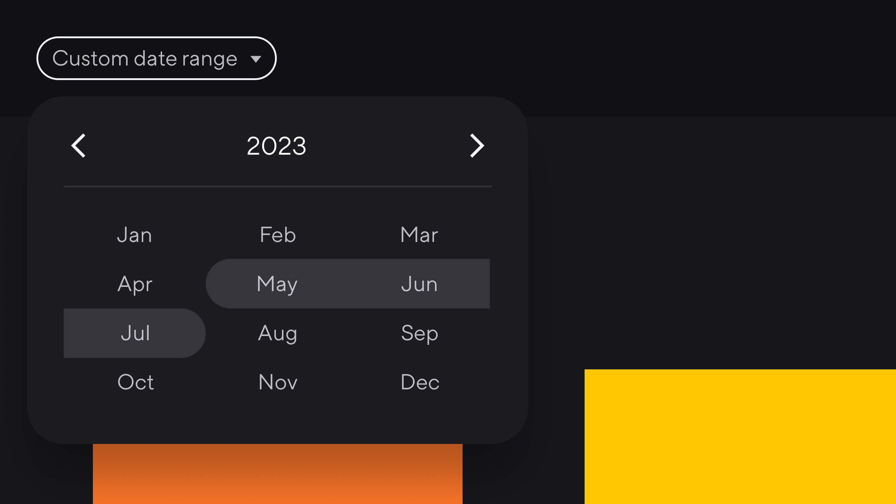
Improved custom date range selector
We made it easier for users to select custom date ranges when creating reports.
Security
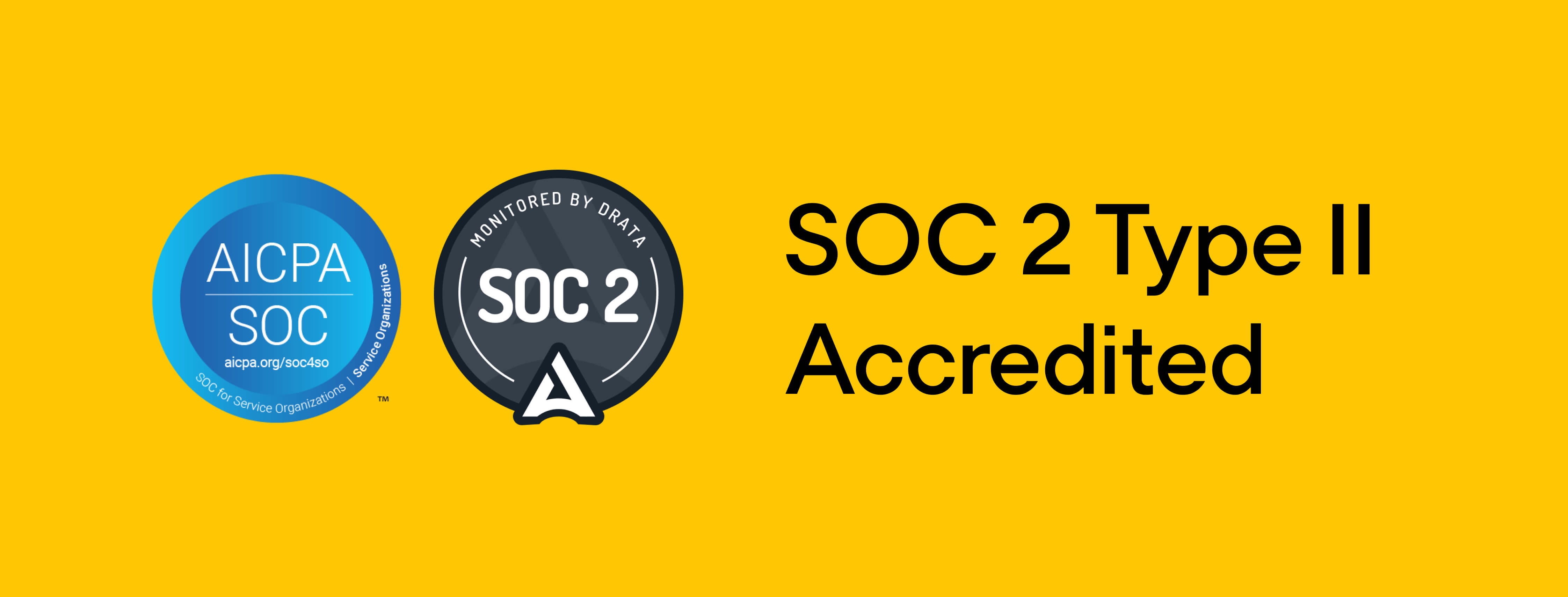
SOC 2 Type 2 accreditation
Last but certainly not least, as part of our ongoing commitment to best-in-class data security, Dandi successfully achieved its SOC 2 Type 2 accreditation.
Our SOC 2 Type 2 focuses on the following trust principles: security, privacy, confidentiality, and availability. For a people analytics platform, which handles sensitive employee data, this accreditation assures that robust data security measures are in place to protect against unauthorized access and data breaches.
Conducted by Sensiba LLP, a nationally recognized CPA firm registered with the Public Company Accounting Oversight Board, this attestation report affirms that Dandi’s information security practices, policies, procedures, and operations meet the rigorous SOC 2 Trust Service Criteria.
To learn more, visit our Trust Center.
More to come
We’re already hard at work on the first new releases of 2024. We look forward to sharing more soon.
Want to take your measurement and reporting to the next level? Learn 4 ways to use intersectional measurement.
More from the blog
Announcing more powerful Dandi data visualizations
Team Dandi - Oct 23rd, 2024
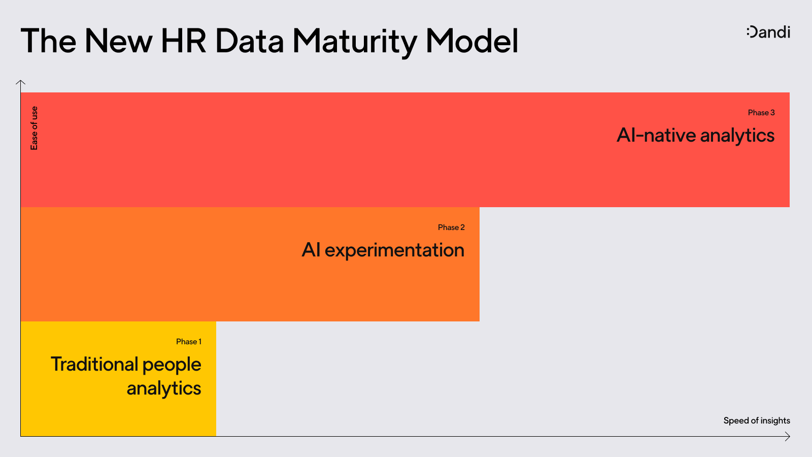
The New Maturity Model for HR Data
Catherine Tansey - Sep 5th, 2024
Buyer’s Guide: AI for HR Data
Catherine Tansey - Jul 24th, 2024
Powerful people insights, 3X faster
Team Dandi - Jun 18th, 2024
Dandi Insights: In-Person vs. Remote
Catherine Tansey - Jun 10th, 2024
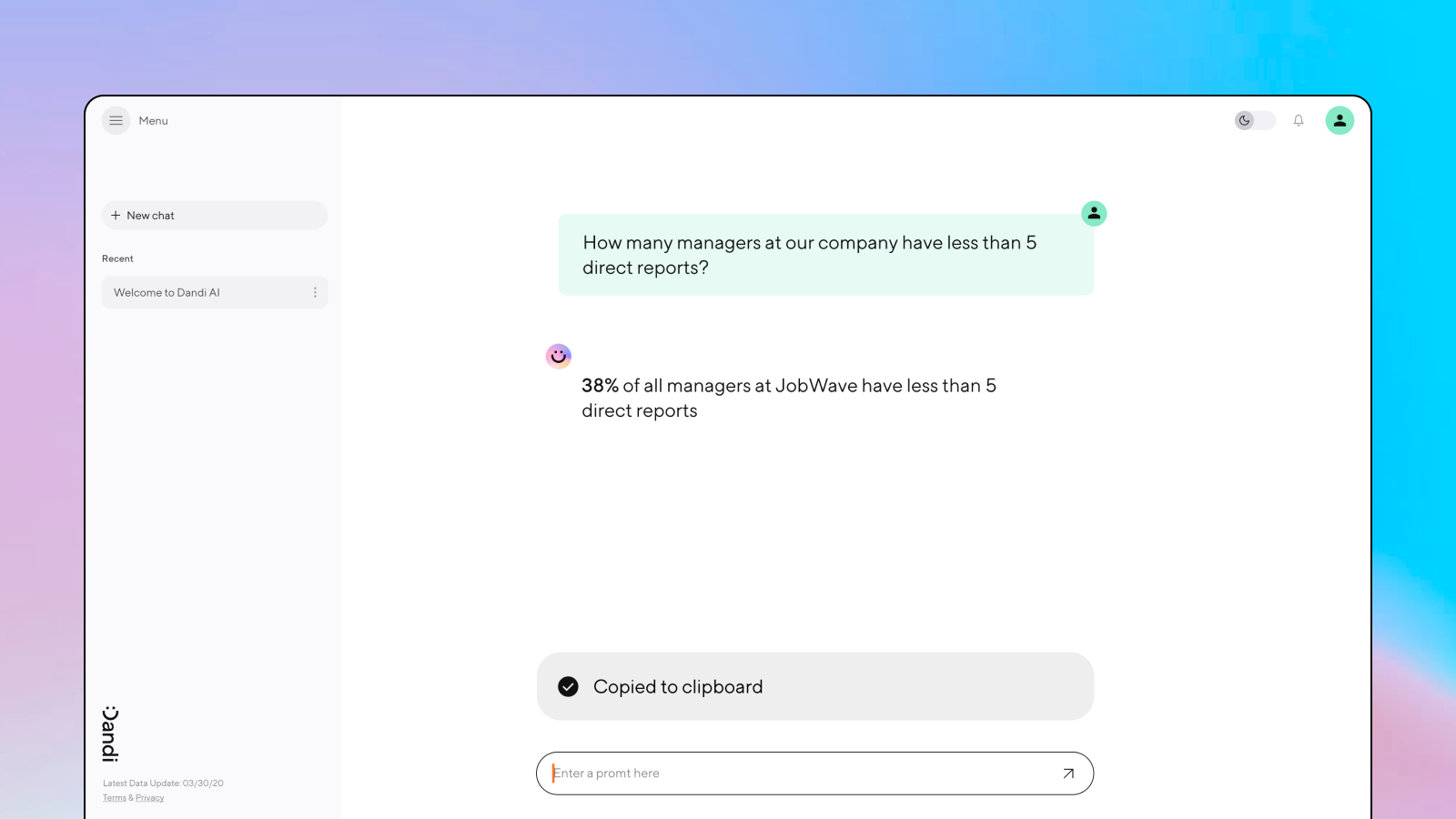
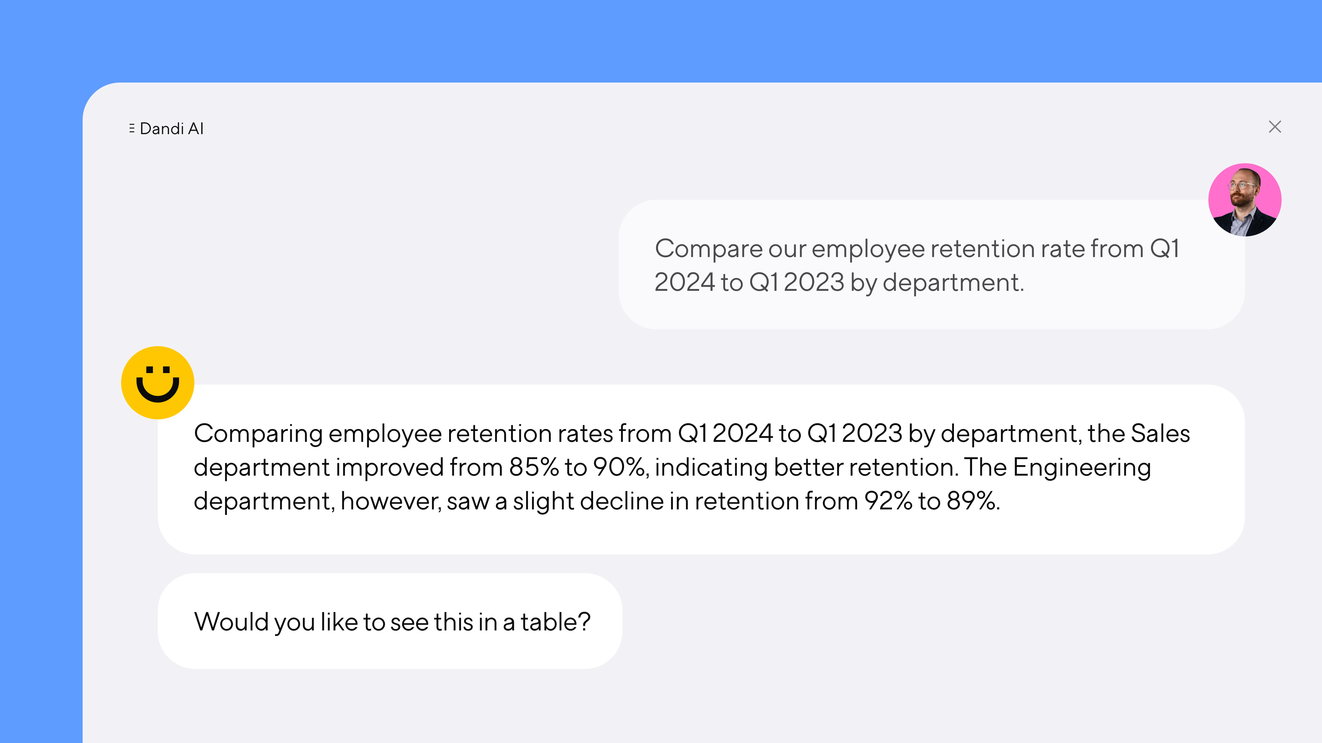
Introducing Dandi AI for HR Data
Team Dandi - May 22nd, 2024
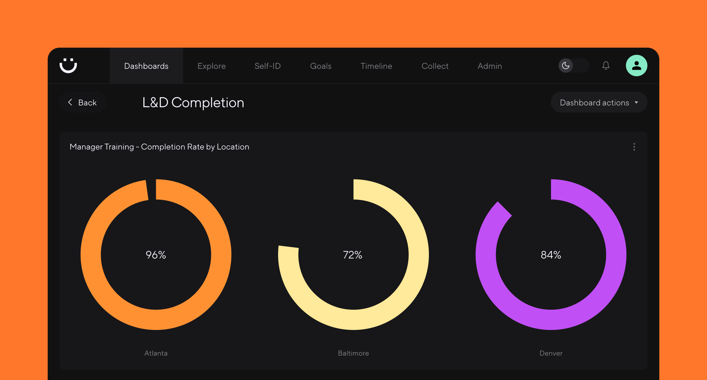
5 essential talent and development dashboards
Catherine Tansey - May 1st, 2024
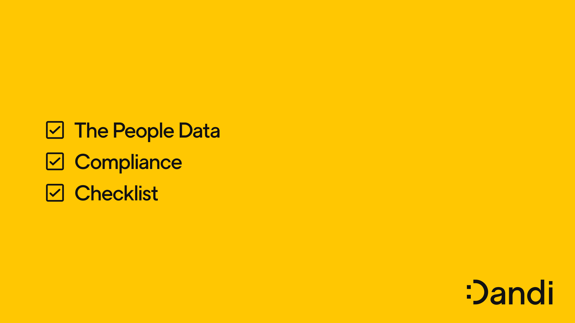
The people data compliance checklist
Catherine Tansey - Apr 17th, 2024
5 essential EX dashboards
Catherine Tansey - Apr 10th, 2024
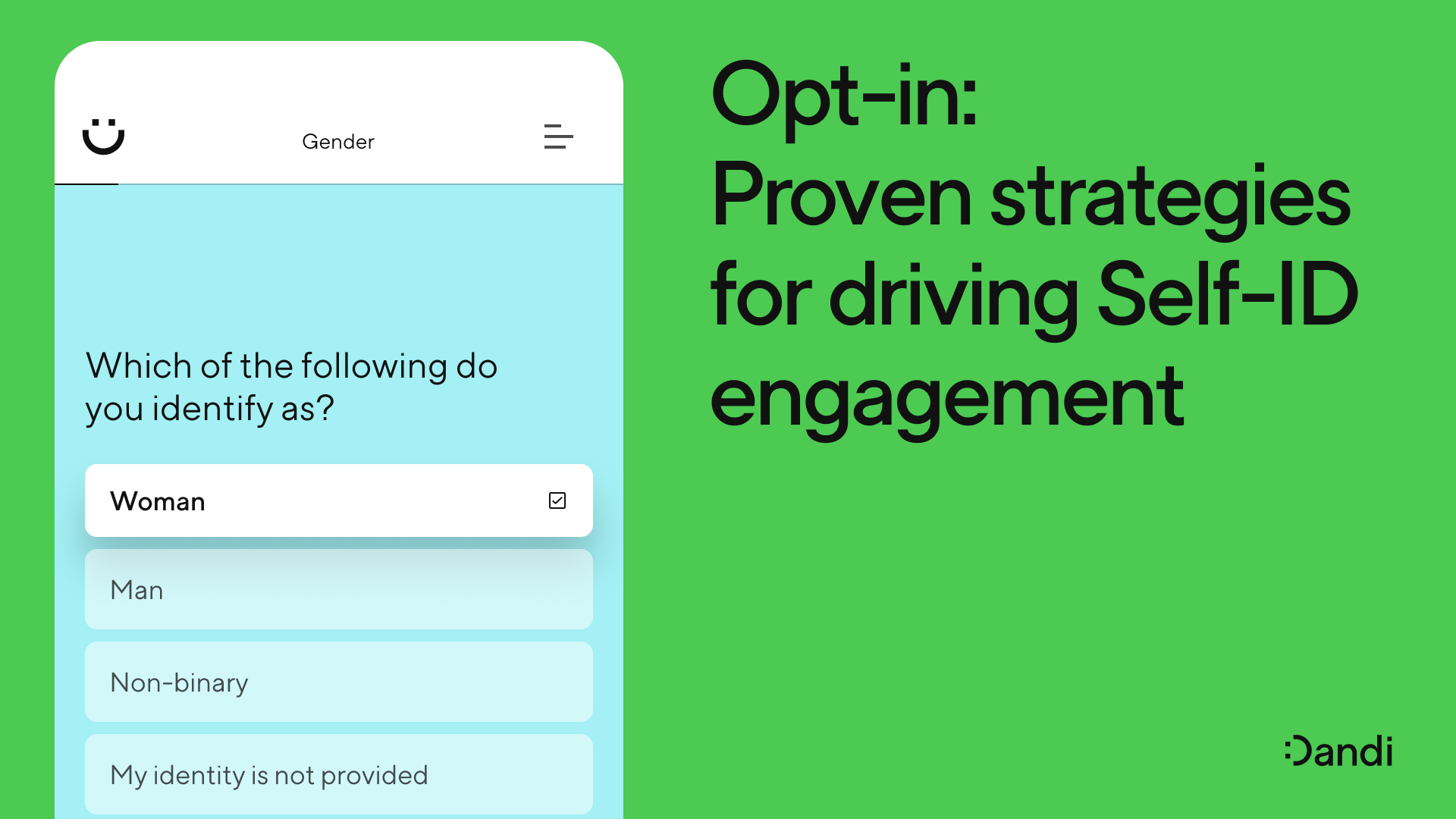
Proven strategies for boosting engagement in self-ID campaigns
Catherine Tansey - Mar 27th, 2024