Reporting & Measurement
Automate HR reporting and gain powerful insights to drive your organization forward.
Automated report and dashboard summaries
Dandi AI produces a clear, accurate, unbiased summary of any report or dashboard with just the click of a button. Work that used to take hours or weeks now happens in seconds.
- Accelerate every reporting projectSpend less time sifting through data and more time telling the story behind it.
- Adjusts with your dataDandi AI refreshes insights automatically, ensuring that your data is always current and reliable.
- Objective analysisDandi’s AI’s impartial analyses give you a clear, unbiased framework for communicating about data across your organization.
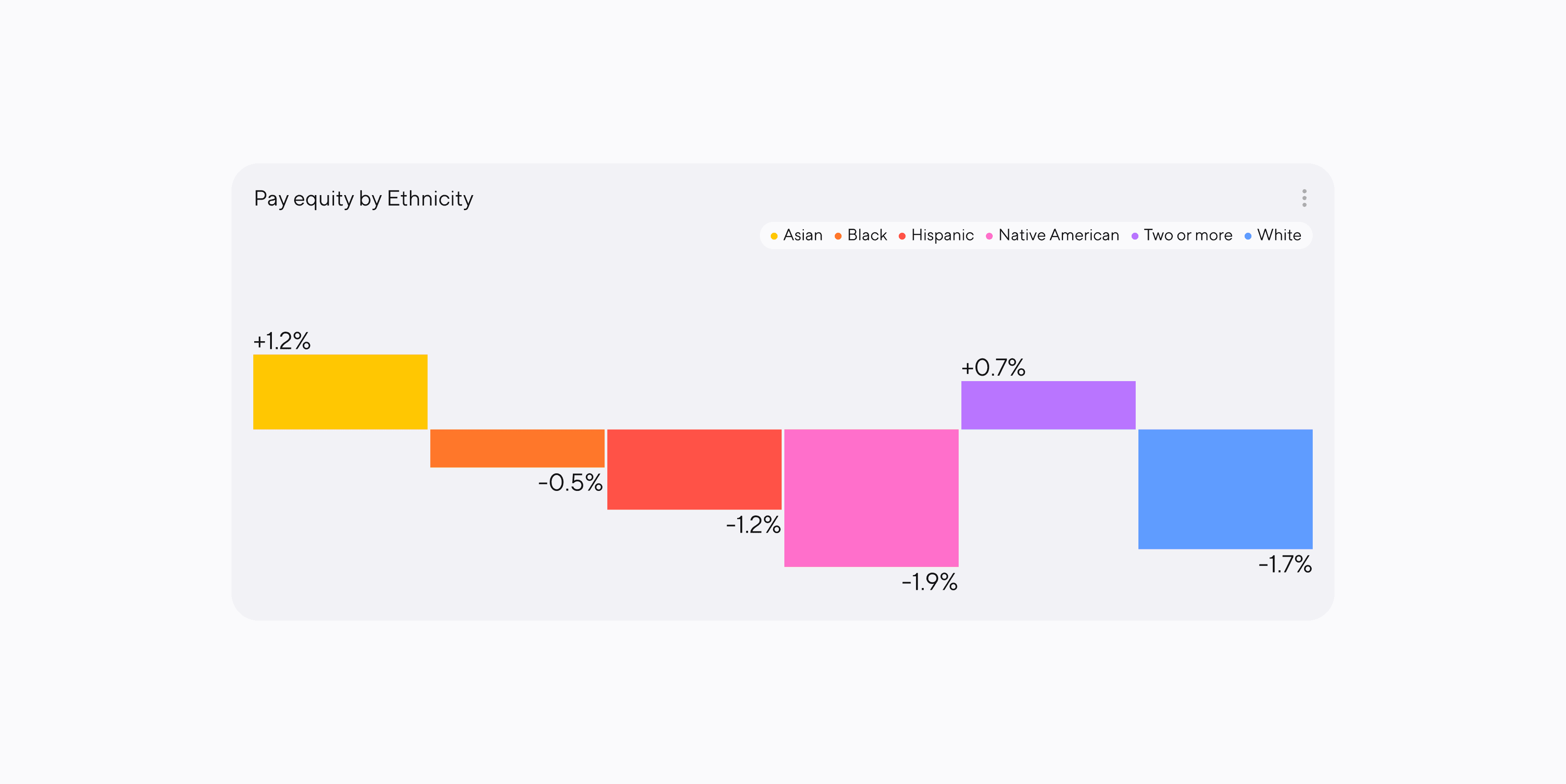
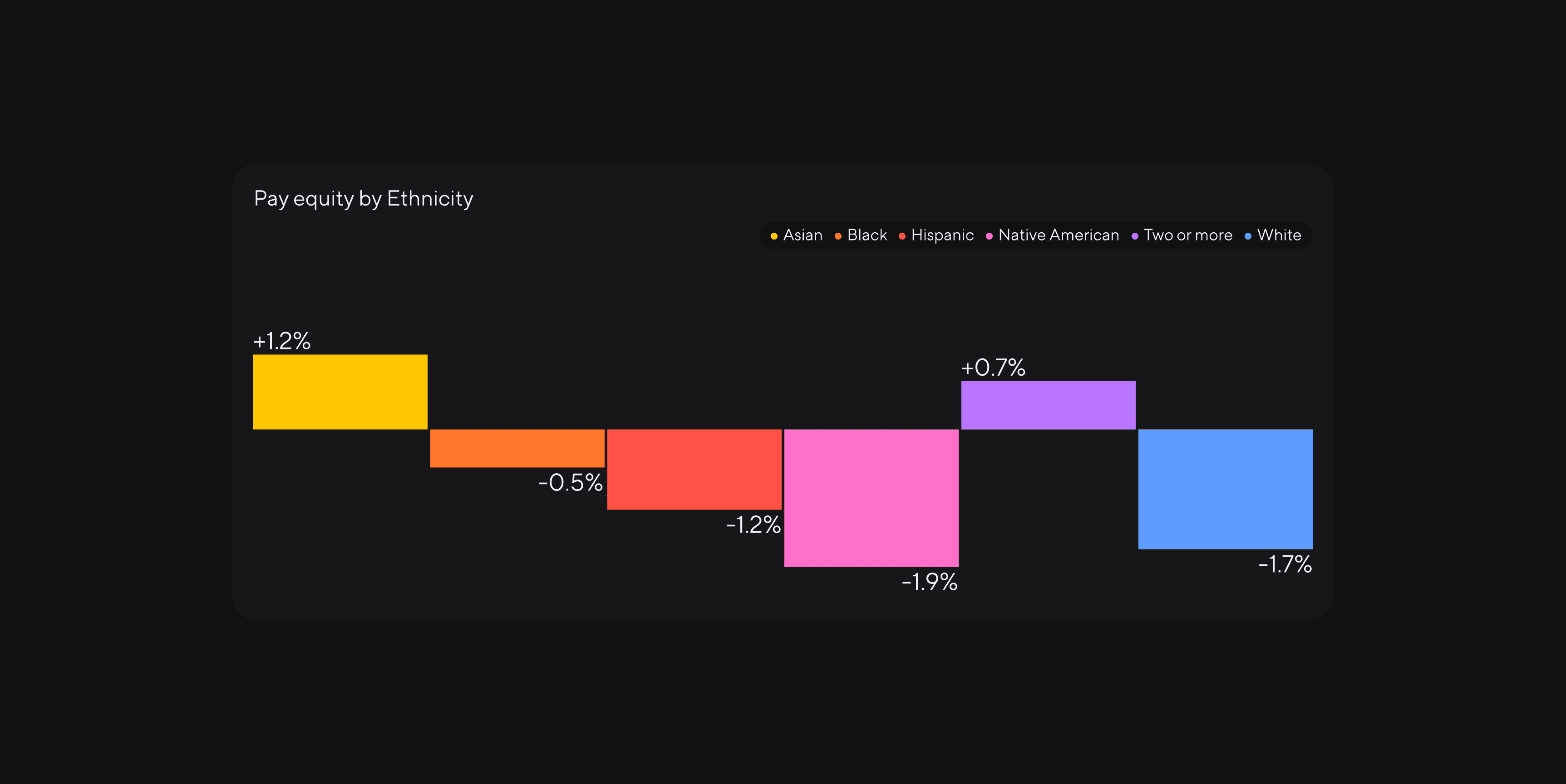
20+ built-in metrics
With over 20 built-in metrics available on day one, Dandi lets you start measuring what matters right away. We continually add new metrics and can customize metrics based on your needs.
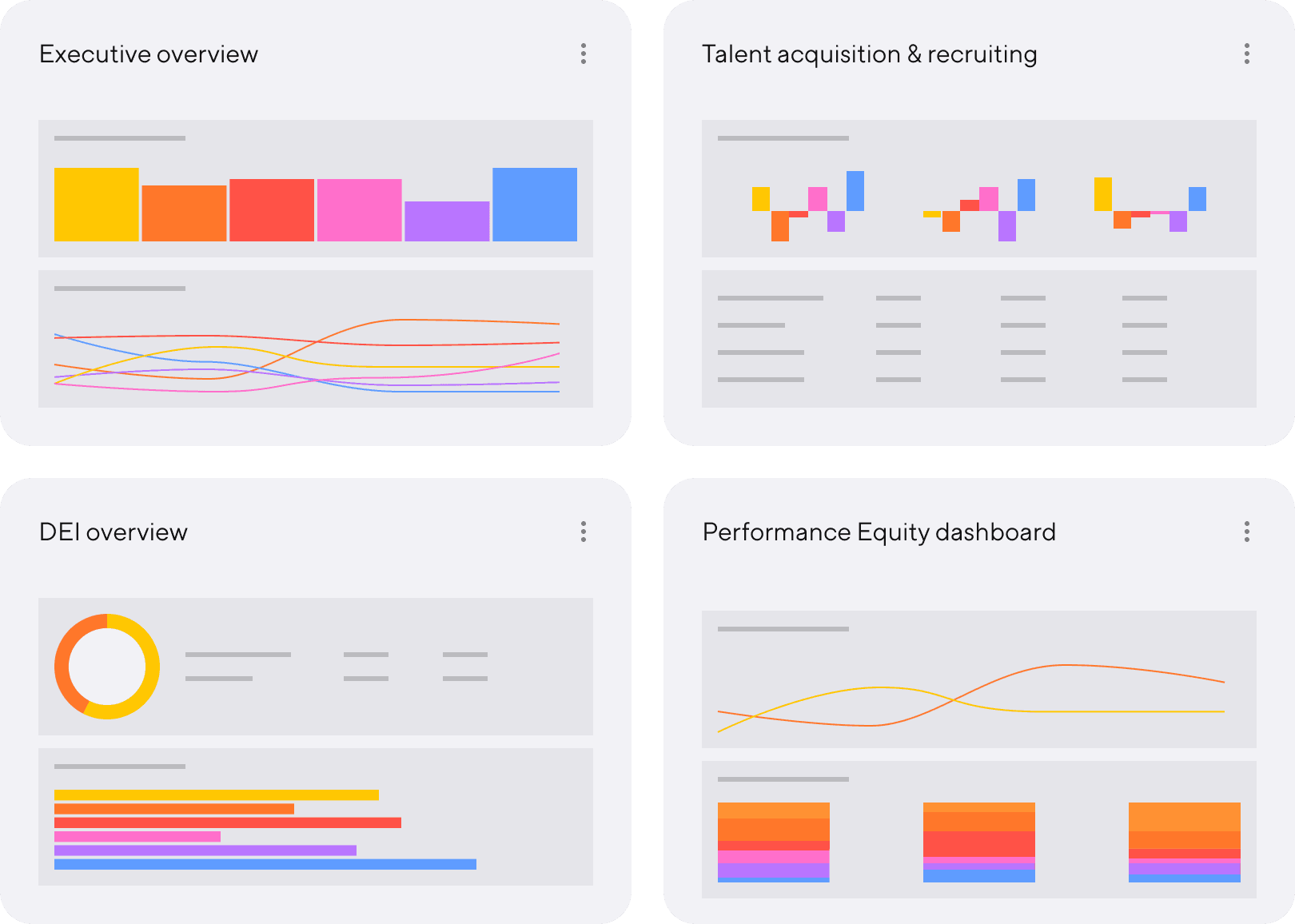
Brilliant data visualizations
With Dandi, you no longer have to waste hours trying to pull together data visuals in Excel. Dandi automatically generates beautiful data visuals in your brand colors and instantly exports them to Google Slides or Powerpoint.
Built-in report and dashboard templates
Dandi’s pre-built reporting and dashboard templates help you track and react to data in real time. Templates featured in Dandi include pay equity, recruiting, hiring, monthly executive updates, quarterly board reports, and more.